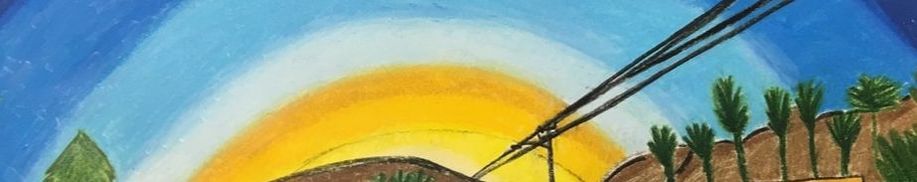
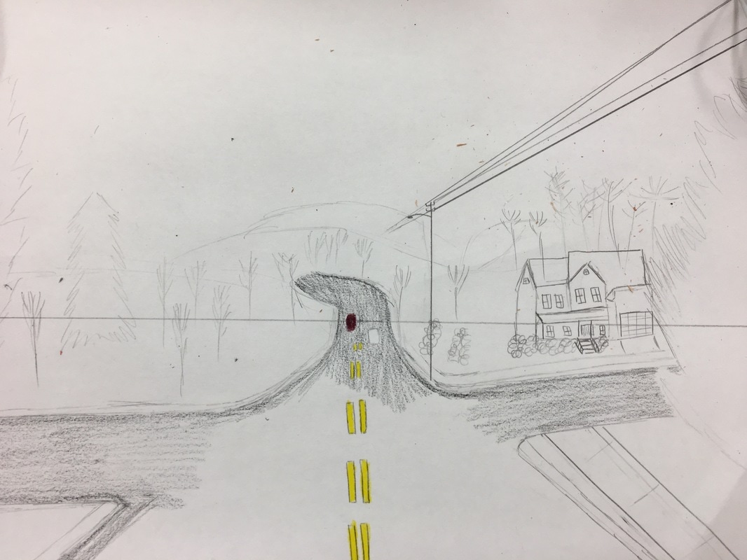
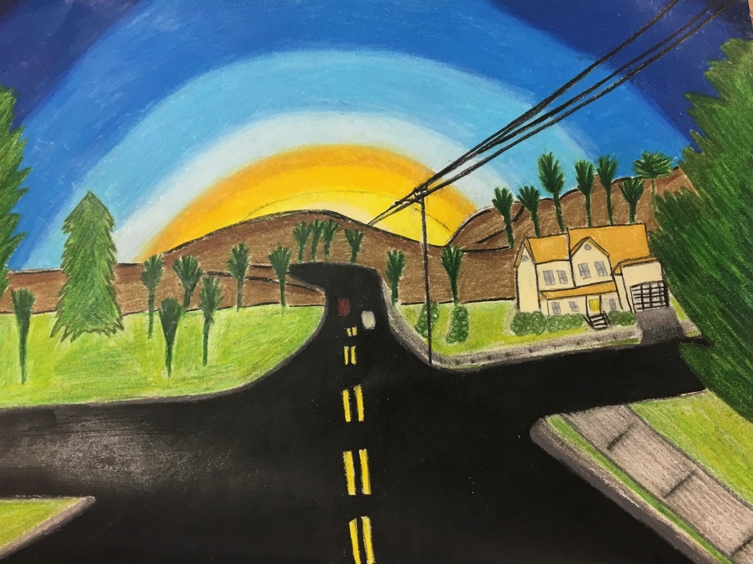
 I used 1 way perspective. The medium I used was prisma colors. I took the photo on the Apex peakway when the sun was setting. I found it difficult to set up the backbone for the drawing. The lines and the vanishing point part really confused me but it worked out in the end.
0 Comments
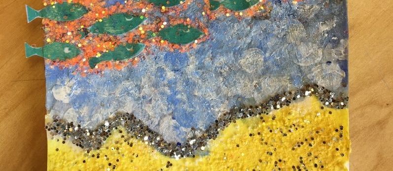
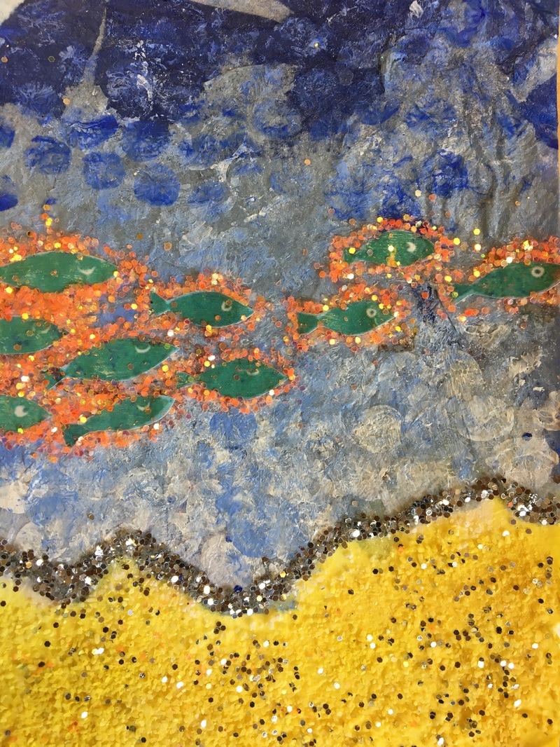
The word for my postcard was "Beach" so I made what I thought looked like a beach.
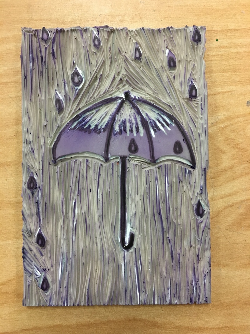
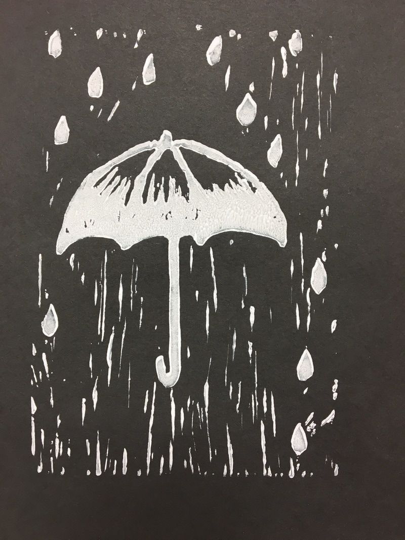
My piece shows off the theme of "Line" because I used lines in the background that kind of look like rain. I was successful because I really like the color scheme. It gives it a dark look which really matches the rain because rain has a gloomy feel mostly. If I were to do it again, I wouldn't cut as deeply on top of the umbrella because it made it look like there was no rain there.
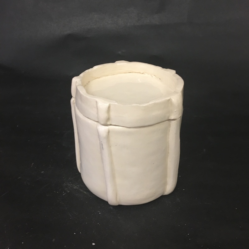
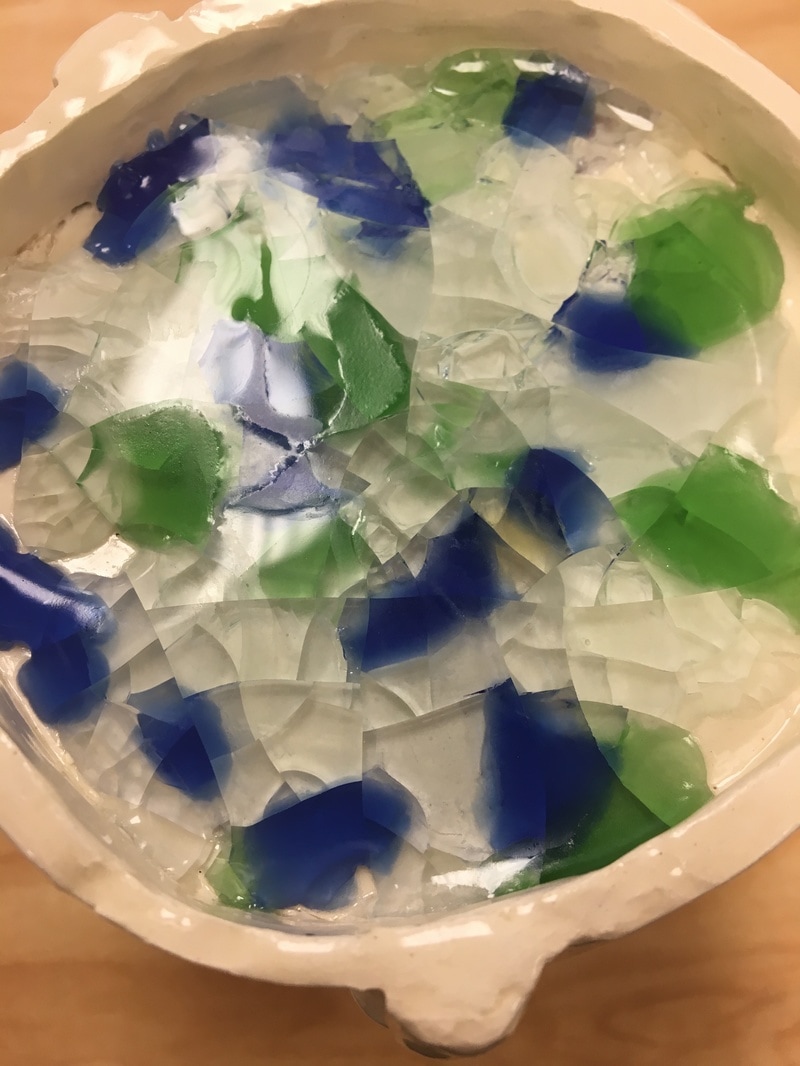
Since the in progress post, I glazed my piece with clear. I didn't paint it because I thought you glazed it before you painted it so that idea kind of went down the drain. My glazewear was almost finished because I couldn't really do anything else to it. I didn't want to leave it so boring so i used multicolored glass and put it in the lid like i planned. Then it was fired and finished. (The pictures with the black backdrop were before I used the glass.)
I had success with the slipping and scoring because my lid fit and none of my pieces broke off. The piece didn't break. If I were to do it again, I would change the order that I glazed and painted because I think it would look better with color.
|
AuthorWrite something about yourself. No need to be fancy, just an overview. Archives
March 2019
Categories |

 RSS Feed
