|
I learned a lot in drawing class. On the first day, I knew I was really bad at drawing. The first assignment was basically a pre-test of what you already knew how to draw and I can proudly say that my skills have gotten a lot better since then. I learned how to draw face, how to draw a clear wrapper, how to use prismacolors, and how to use a scratchboard.
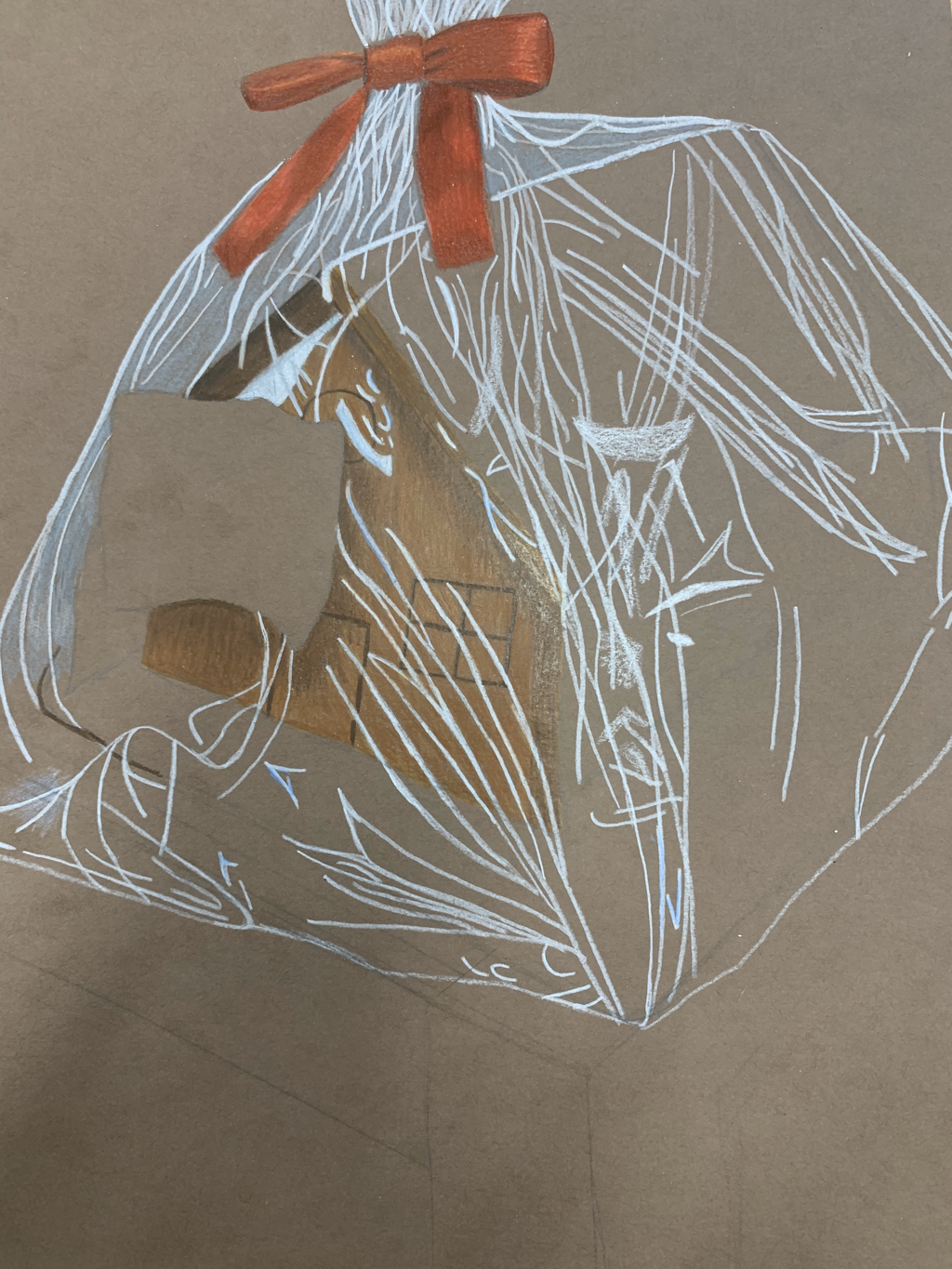
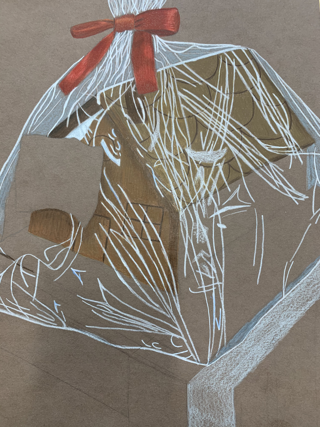
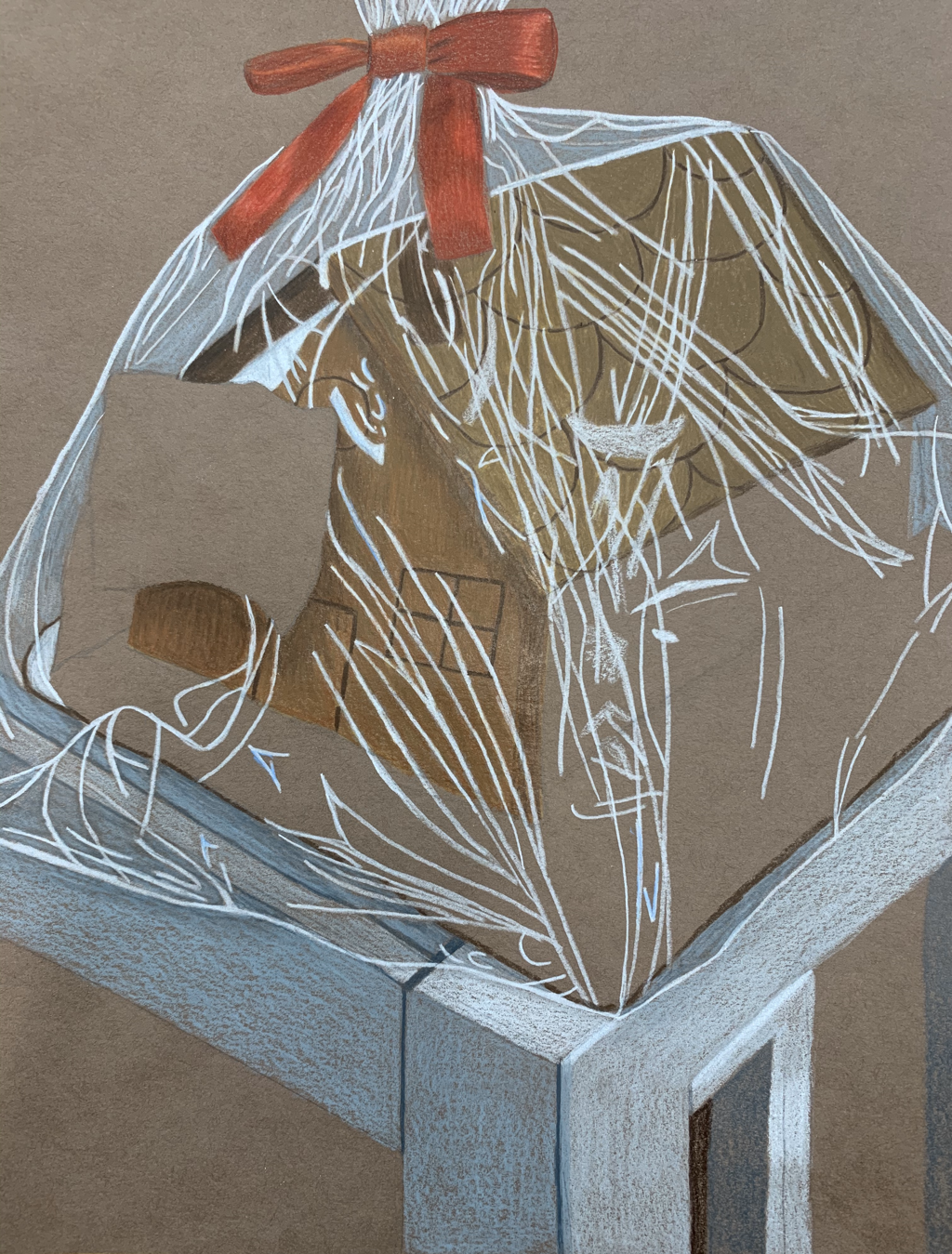
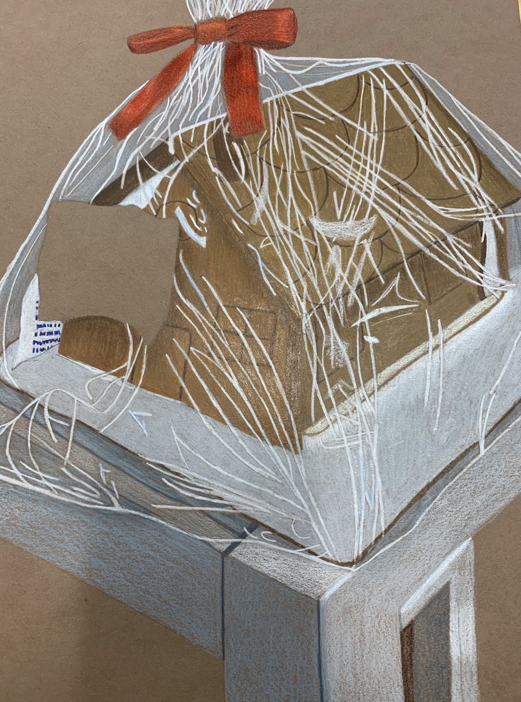
My favorite project this semester was the "Look At What You Can See Through" project. I think I did really good at blending prismacolors, especially in the bow on the top of the wrapper. I was very proud of that project. I think my worst project was the still life. I was just starting to learn how to use different values and I think if I tried drawing the same still life now, it would come out a lot better. Even though I had a hard time in this class, I learned a lot and I had a lot of fun.
0 Comments
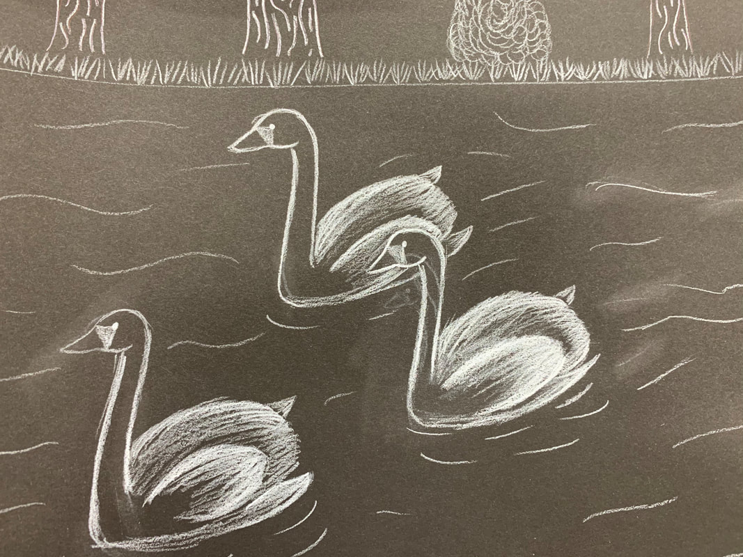
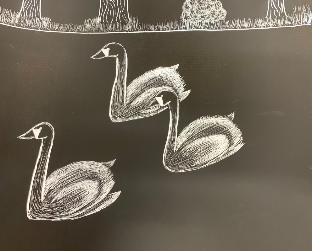
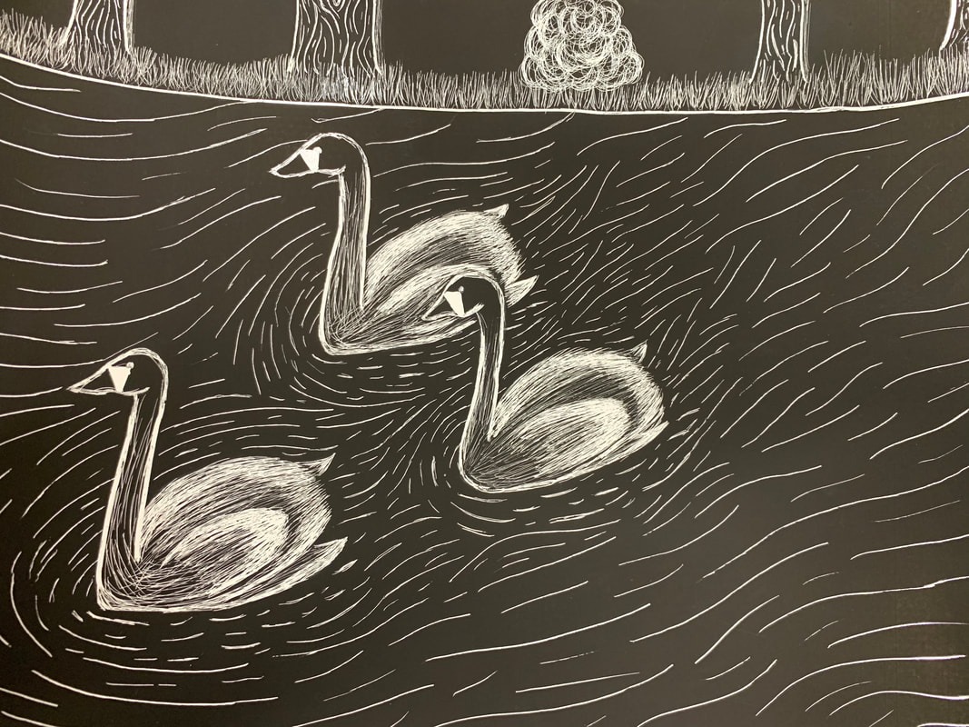
1. The subject matter is the swans on the lake. The meaning of my artwork is 'Just keep swimming' because the swans gracefully swim through their problems.
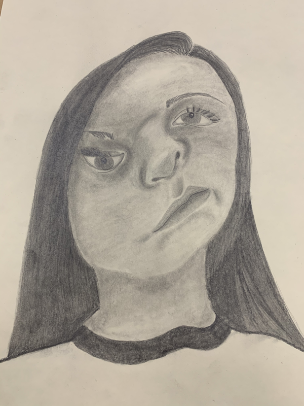
2. I used the texture of the swans feathers and the texture of the water. My favorite texture is the texture of the bush behind the grass beyond the water. I think I did a really good job on the bush. 3. I balanced my artwork by adding 3 swans so there was more to focus on. I originally only had 2 swans but I thought it looked too empty so I added a third. I created a well organized composition because my horizon line is in the distance and my swans are a good focus point. 4. I implied movement because the way the water looks around the swans. The ripples show where the swans have been and where they are going. I think it looks realistic as to show the movement in the ripples in the water. 5. I could improve my artwork by adding another swan to the back of the group. I could also improve my artwork by changing the sizes of the swans to make them look bigger or smaller based on where they are in the foreground or background. 6. I demonstrated a wide range of shading values by using more or less lines. I tried to shade behind one of the swan's heads to make it look like it was standing out in front of the other swan's feathers. I think I did a good job of not letting my values blend. These are the in-progress photos for this project. 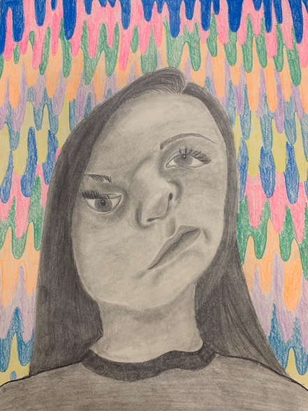 This is my final product. 1. To develop my drawing, I had to learn how to draw each feature individually. Before starting the final project, we spent a day on each of the facial features including the eyes, nose, mouth, and hair. I put all of the skills I learned together to complete this project.
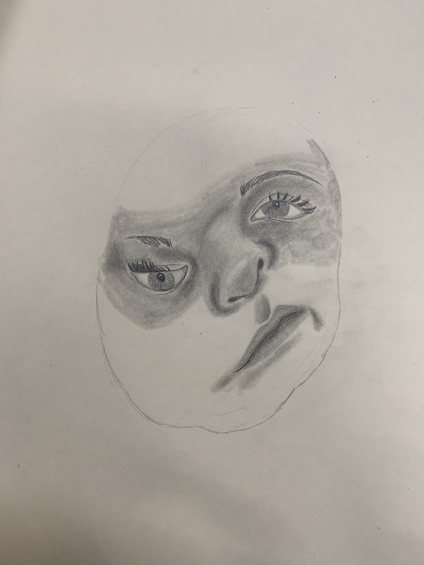
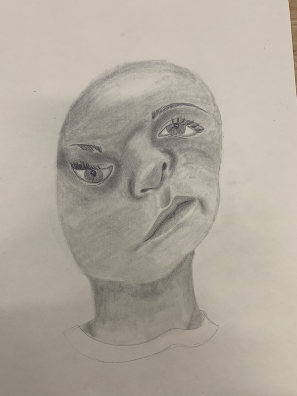
2. I found the different values by looking at my reference photo. I used a blending stump along with different values of pencils to show the shadows and values of the face. 3. I did a full range of values as you can see in the drawing. I used every value of pencil and I have very light and very dark values shown in my drawing. 4. I think my artwork was executed neatly. I think the dripping in the back could be more solid but I like the way it looks. I think it makes the portrait stand out better. 5. I was able to capture my look by trying to copy the picture exactly. I used a picture from snapchat with a swirling face filter over it. 6. I couldn't use the traditional 5 eye wide face because my face in my reference photo was not a natural shape. I tried to do as best as I could but I had a really weird photo to use. 7. I think it was very important to learn all of the features before starting to do an entire face. You can learn how to do all of the details before you see it put together. I think if I didn't learn how to do the features first, the picture would look a lot different and a lot less realistic. 8. I think the assignment where we drew a face over the skull to see the placement of the features was very beneficial to me. It helped me learn how to fill in the shadows of the face and show the highlights and contours of the face. 9. I think my picture was harder to draw because it wasn't the shape or the look of a traditional face. I also had a hard time with the shading of the face because I messed up on it on the assignment with the skull but I think that assignment helped me learn a lot about what not to do.
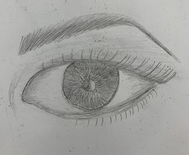
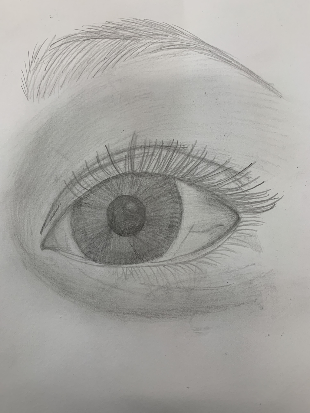
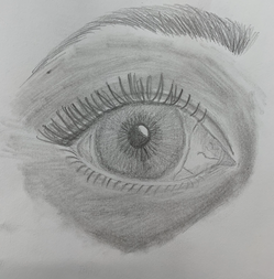
The photo on the left is my drawing while following the video. The middle and right photos are drawings of my own eyes. I drew my left eye first and my right eye second. 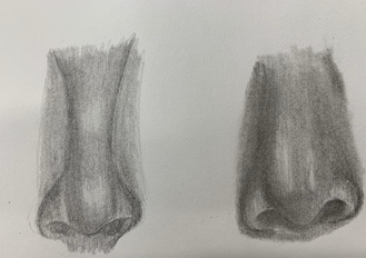 The nose on the left is following the video and the nose on the right is based on my own nose. 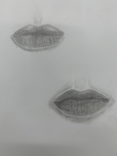 The mouth on top is based on the video and the mouth on the bottom is based off of my face. 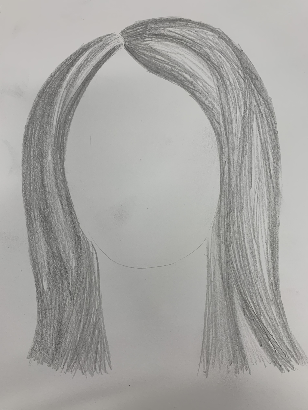 This is a drawing of hair based off of the tutorial we watched. 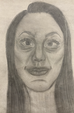 This is the final project based off of a picture of my face.
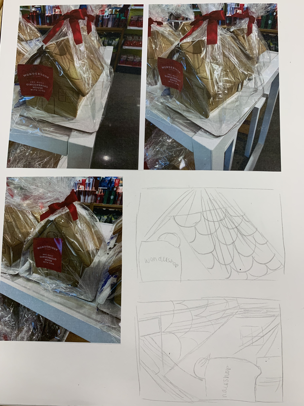
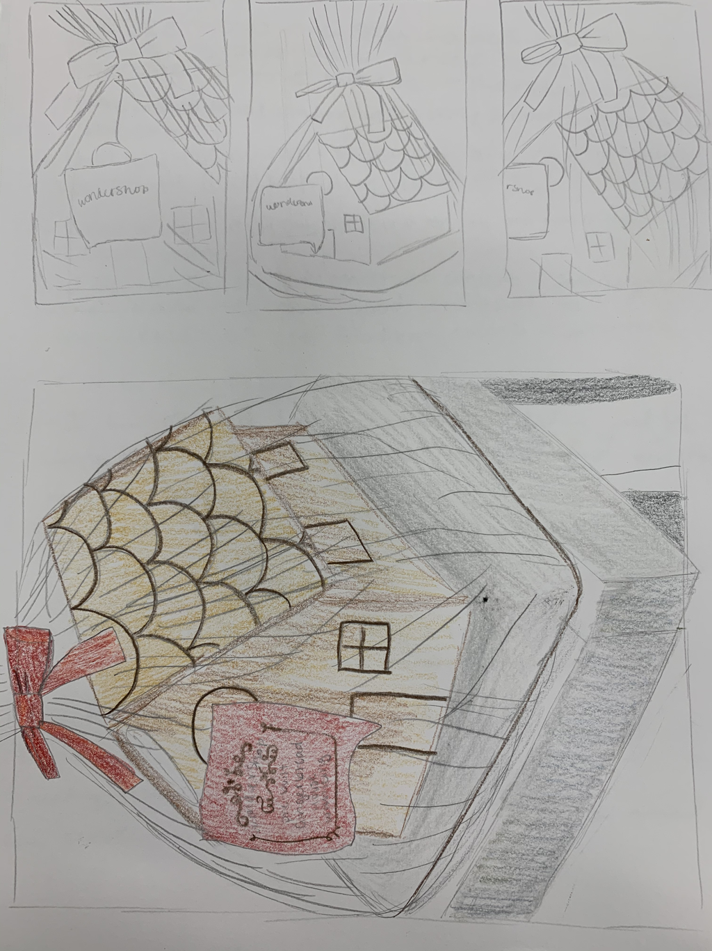
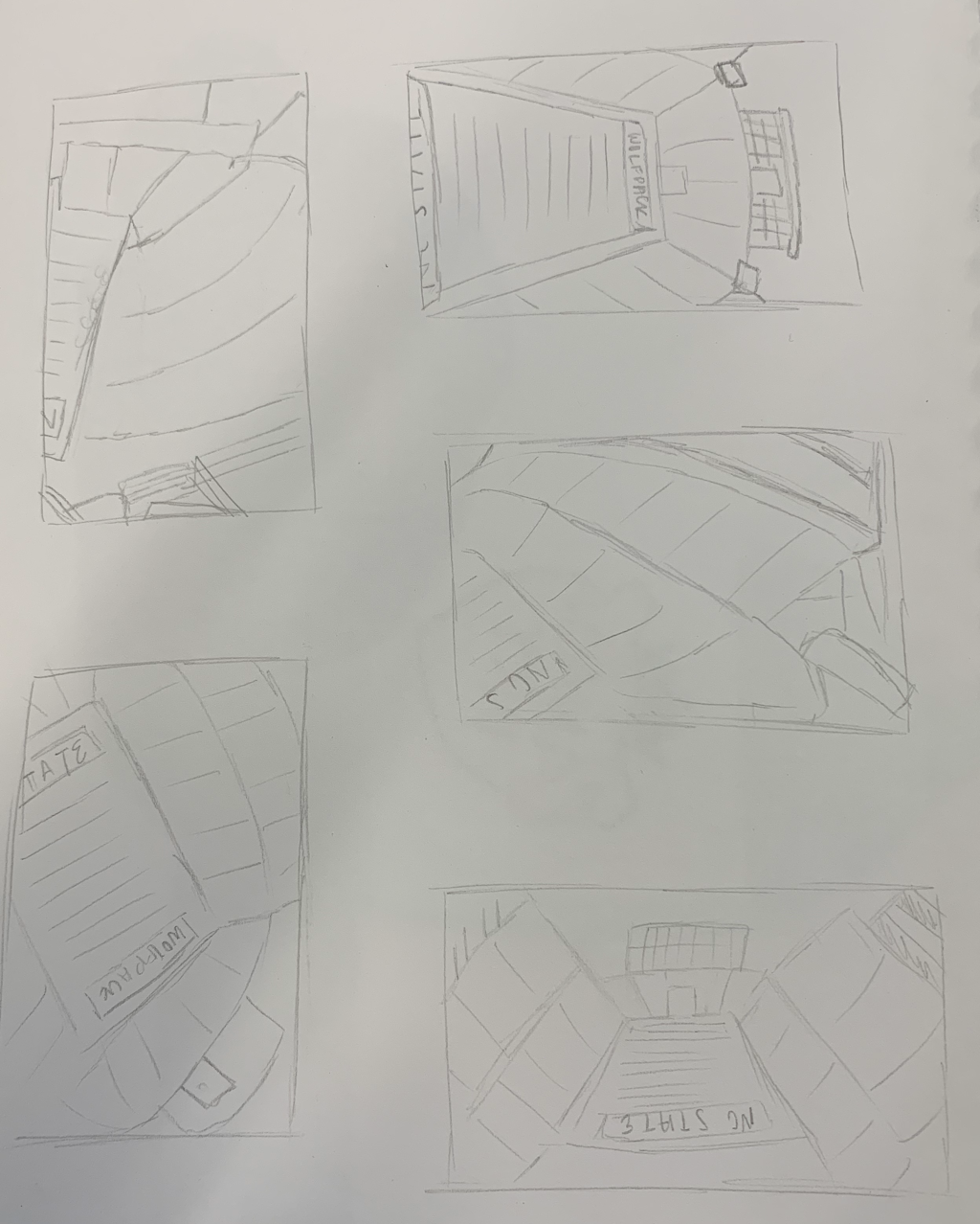
These are the sketches I used to plan out my drawing.
These are my in progress photos of my piece.
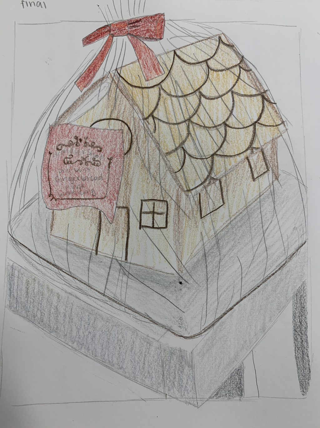
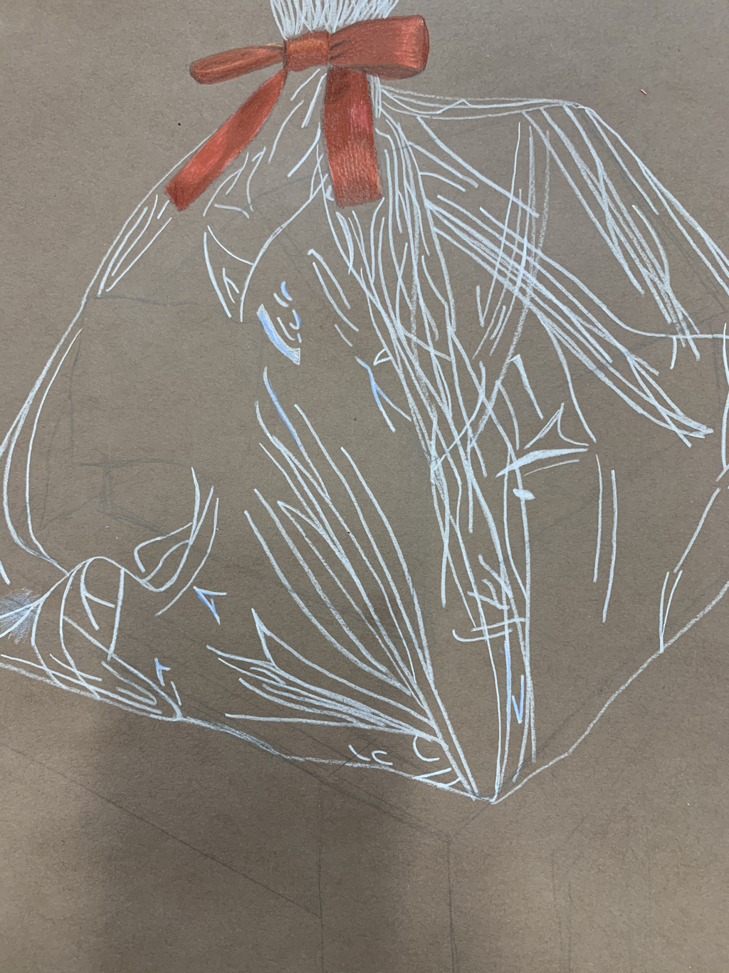
This is my finished piece next to the picture I based it off of.
1. I think my drawing is very neat and well executed. I am very happy with the way it turned out and I think this is my best piece so far.
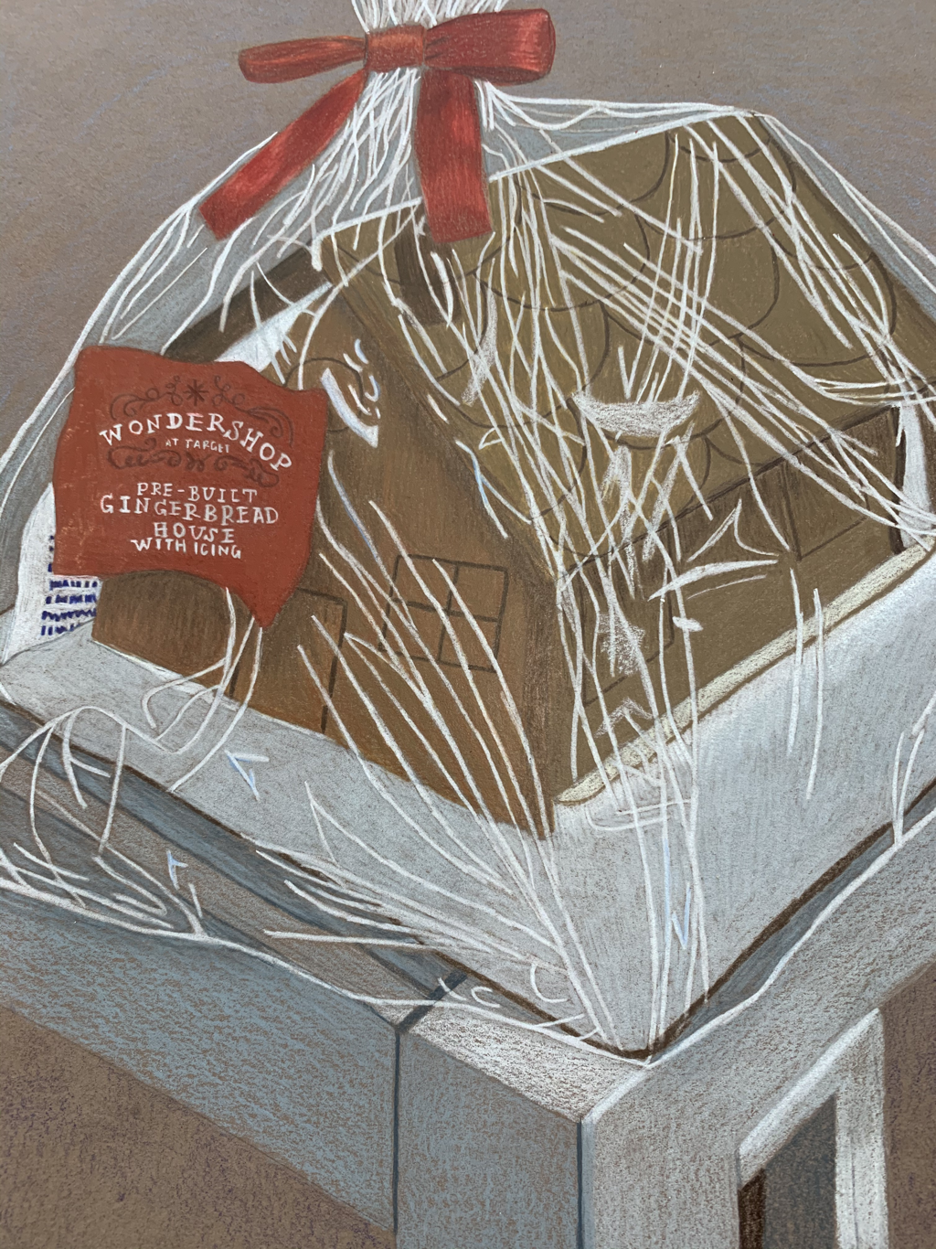
3. The main colors I used were shades of brown and gray. I used reds in some of the details and oranges to blend in the brown. I used blues for the background and some minor details. I used a lot of white lines to show the highlights. I think the colors go well together and I think the red compliments the browns nicely. 4. I created contrast by the colors I used. The different shades of brown and orange I used contrast with each other to show shadows from the label and the ribbon. I think the red contrasts from the white wrapper nicely where the bow is. 5. I think the shadows I used were very subtle but very important. I showed the shadow of the label and the shadow of one of the ends from the ribbon from the bow. I also used shadows under the roof of the house. I think my highlights were good as well. I think the highlights I did on the table were really good. 6. The background color I chose was blue. I didn't want to add too much to the background because I felt the gingerbread house should be the main focus of the piece and I didn't want to take away from that. I thought it would stand out on a blue background. 7. I think understanding Prismacolor pencils is important because you need to know how to use them. They are different than using regular colored pencils and without the practice I have had this semester, I don't think I would be able to do what I did on this project. 8. I think I could've done better in making the lines less choppy on the wrapper but I am still very happy with it. I had trouble with making the wrapper look realistic.
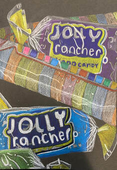 This is a drawing of clear candy wrappers on candy. This was the last small project in this unit.
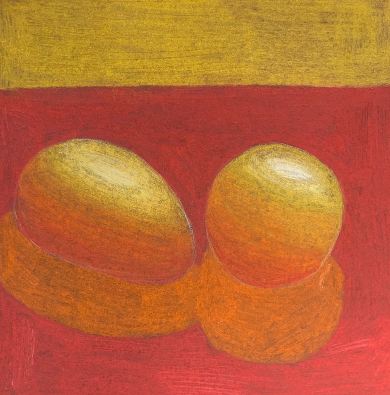
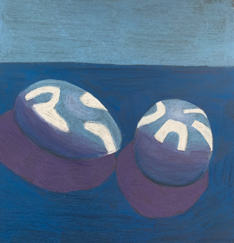
I drew these eggs in pastel pencils. One has unique spots on it because one picture is based off of lights through a colander and one is based on a picture of just light.
My first "Look at that view" blog post won't let me edit it anymore so I will add everything I missed here.
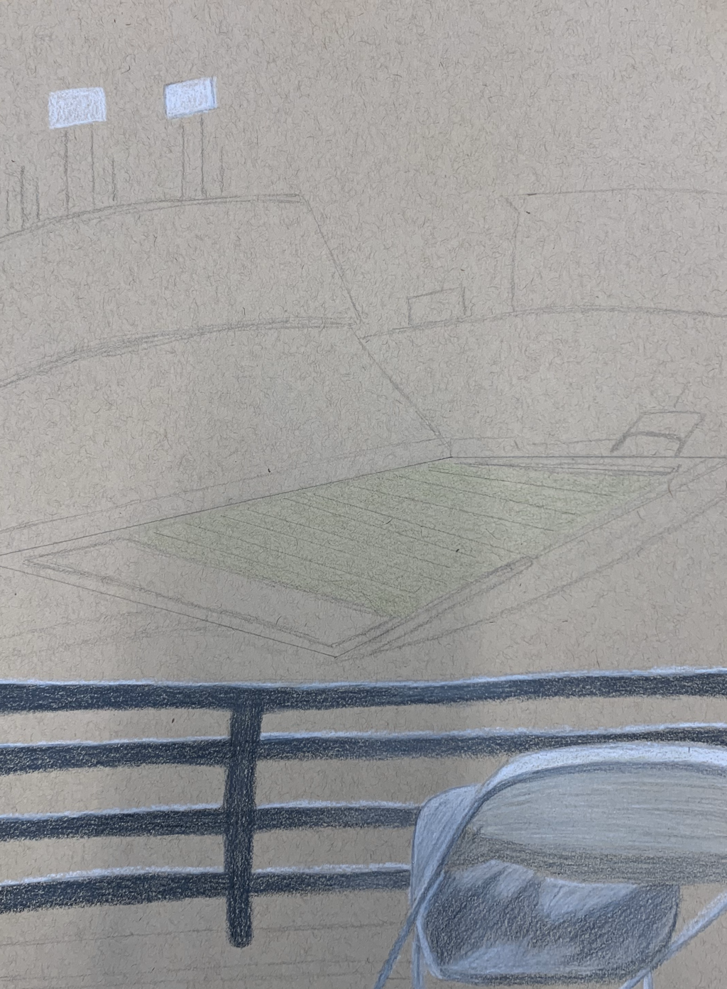
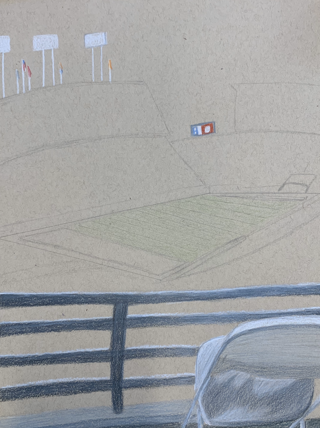
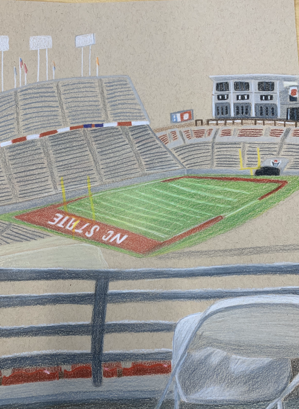
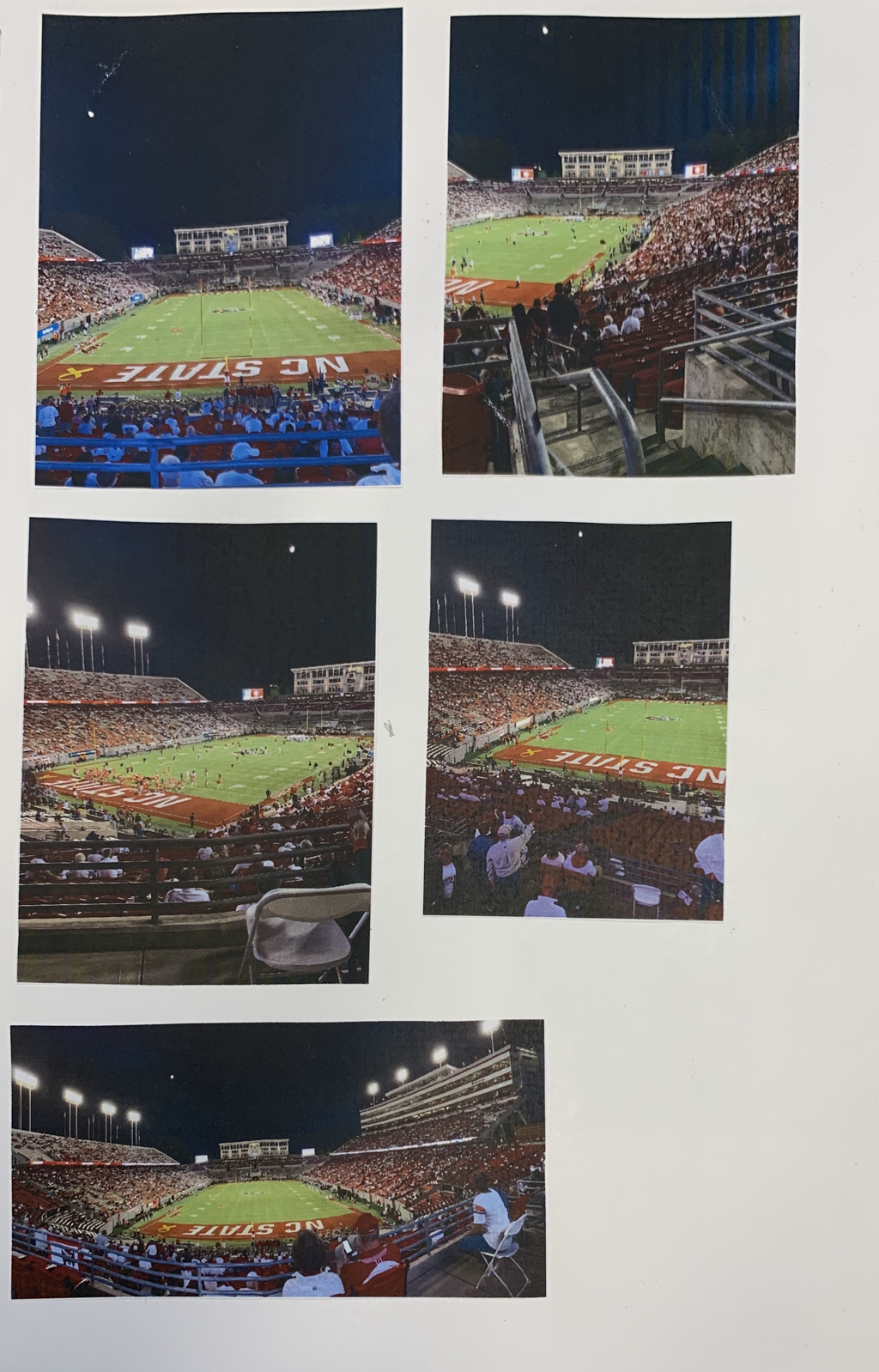
These are my in progress photos. I started with the rails and the chair at the bottom then started on the field, and then jumped to the building on the other side and the stadium chairs and benches.
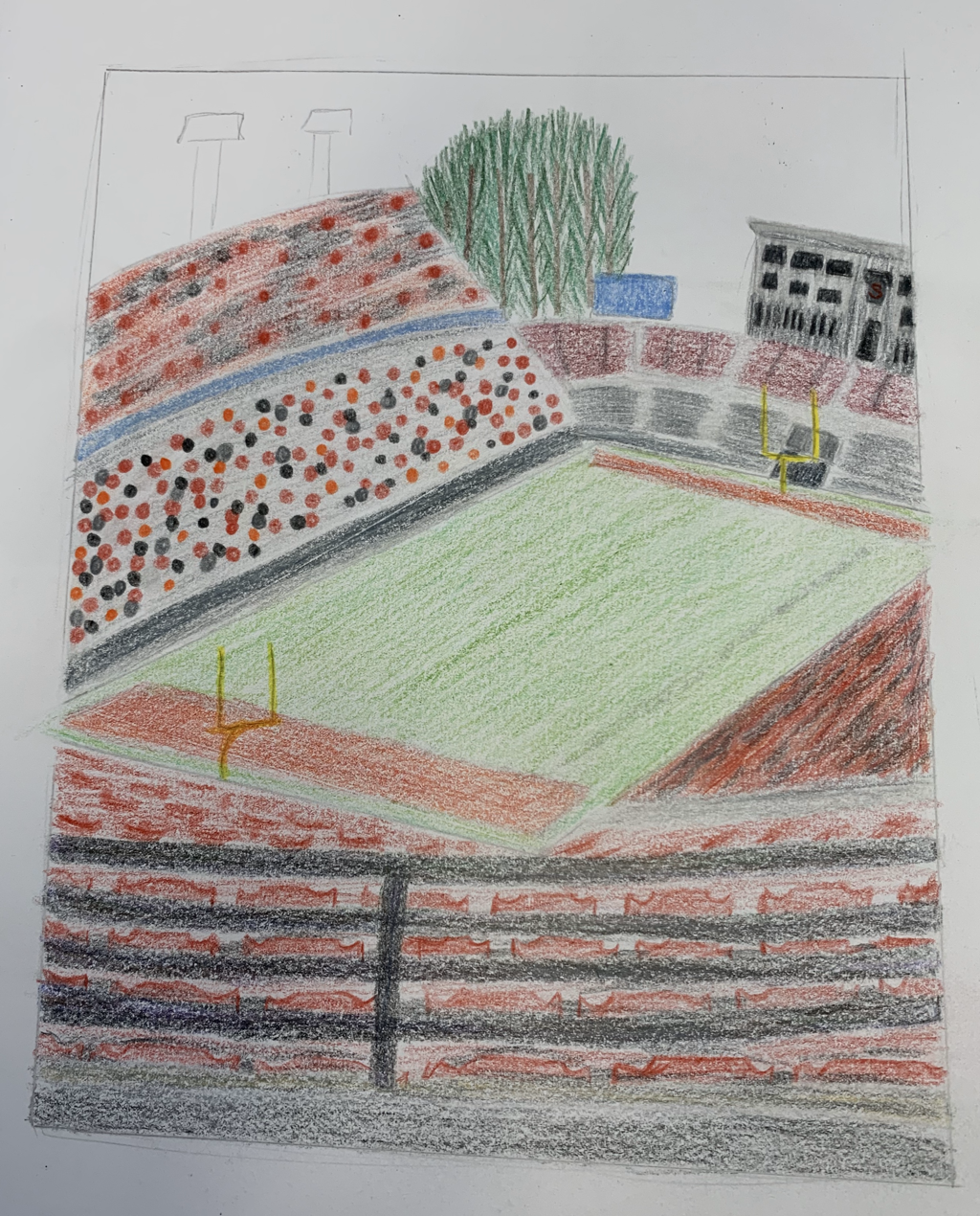
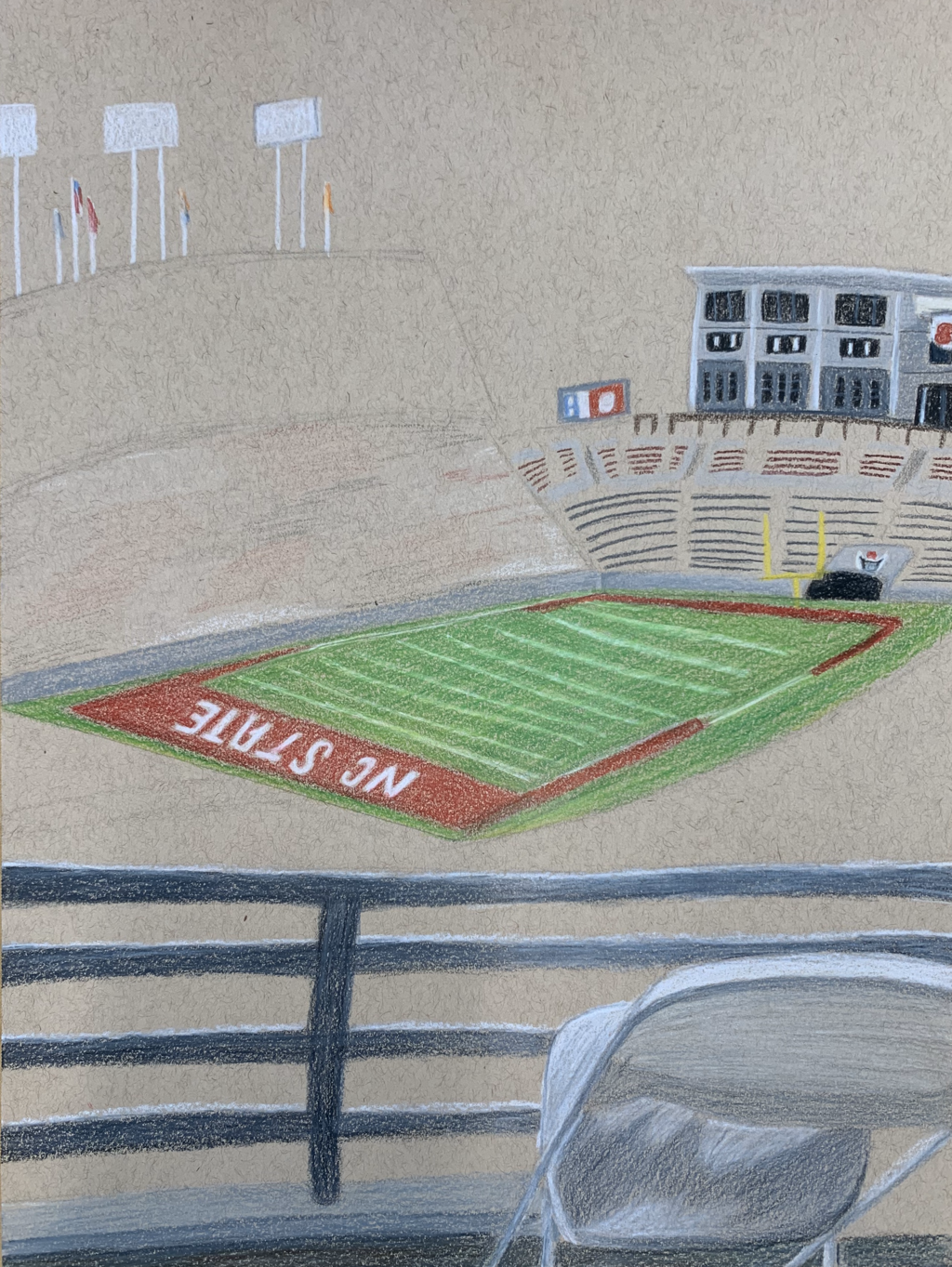
Final Project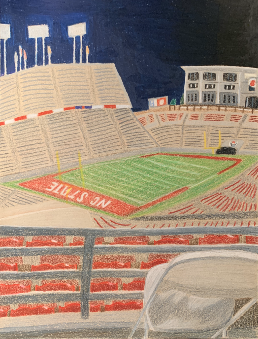 This is my final project for the look at this view project. I drew the Carter-Finley football stadium in Raleigh, NC.
1.I created an interesting point of view by making the field look diagonal. I stood at the corner of the stadium so the field looked like a diamond more than a rectangle. It was very hard to create but I think it was successful. I had a very hard time trying to map out the shape of the field exactly how it was in the pictures because the lines didn't always match up with one another. 2. Perspective is hard to draw because the shapes are harder to find. I especially had a hard time trying to make the things farther away smaller than the things up close. I drew red stadium chairs and I tried to make them smaller the further you got, but I didn't do a very good job. 3. The colored pencil exercises were important because they showed me how to layer colors and how to blend them together to create the right values and the right colors. That was one of the hardest parts for me because it was hard for me to find the right colors to create the perfect values and I ended up messing that up a number of times. 4. I tried layering my colors. I used a layer of light shading underneath darker shading for the field and for the metal bars. I used lines and shading underneath for the farther stadium chairs and for the sky I used different blues and blacks to try to create the darkest sky possible. I tried to eliminate all of the white dots from the paper in the sky. 5. I was able to achieve depth by showing the different sizes of the stadium seats. The closest ones are bigger and more detailed and the ones far away are smaller and less detailed. I also showed depth with the building on the far side of the stadium being small compared to the chair up close. The different end zones have different levels of detail because one is closer and one is far to show depth. 6. I found colored pencil to be hard to use because you need a lot of patience because you need to do so many layers. If you use too dark of a color, it can mess everything up. Sometimes it is really hard to blend a darker brown into something that should be light tan colored. I also had trouble trying to add white after I added other colors. Adding white on top of red made a pink color when I really needed a white color to show a reflection of light. I also found that prismacolors are very hard to erase and that once you color something, you should just go with it because there is no going back. 7. I wish I had more time to practice for this project. I think the apple and the shapes were very good practice but my picture didn't include many big shapes but had more small details. I wasn't very well prepared for the small details and I think that was one of the things that messed me up during this project. I took this project as a learning experience as well as an assignment because I learned a lot about colored pencils that I didn't know before while in progress with the piece.
Final Project This is my final project for the look at this view project. I drew the Carter-Finley football stadium in Raleigh, NC.
1.I created an interesting point of view by making the field look diagonal. I stood at the corner of the stadium so the field looked like a diamond more than a rectangle. It was very hard to create but I think it was successful. I had a very hard time trying to map out the shape of the field exactly how it was in the pictures because the lines didn't always match up with one another. 2. Perspective is hard to draw because the shapes are harder to find. I especially had a hard time trying to make the things farther away smaller than the things up close. I drew red stadium chairs and I tried to make them smaller the further you got, but I didn't do a very good job. 3. The colored pencil exercises were important because they showed me how to layer colors and how to blend them together to create the right values and the right colors. That was one of the hardest parts for me because it was hard for me to find the right colors to create the perfect values and I ended up messing that up a number of times. 4. I tried layering my colors. I used a layer of light shading underneath darker shading for the field and for the metal bars. I used lines and shading underneath for the farther stadium chairs and for the sky I used different blues and blacks to try to create the darkest sky possible. I tried to eliminate all of the white dots from the paper in the sky. 5. I was able to achieve depth by showing the different sizes of the stadium seats. The closest ones are bigger and more detailed and the ones far away are smaller and less detailed. I also showed depth with the building on the far side of the stadium being small compared to the chair up close. The different end zones have different levels of detail because one is closer and one is far to show depth. 6. I found colored pencil to be hard to use because you need a lot of patience because you need to do so many layers. If you use too dark of a color, it can mess everything up. Sometimes it is really hard to blend a darker brown into something that should be light tan colored. I also had trouble trying to add white after I added other colors. Adding white on top of red made a pink color when I really needed a white color to show a reflection of light. I also found that prismacolors are very hard to erase and that once you color something, you should just go with it because there is no going back. 7. I wish I had more time to practice for this project. I think the apple and the shapes were very good practice but my picture didn't include many big shapes but had more small details. I wasn't very well prepared for the small details and I think that was one of the things that messed me up during this project. I took this project as a learning experience as well as an assignment because I learned a lot about colored pencils that I didn't know before while in progress with the piece. |
AuthorWrite something about yourself. No need to be fancy, just an overview. ArchivesCategories |


 RSS Feed
